dLite Tokens
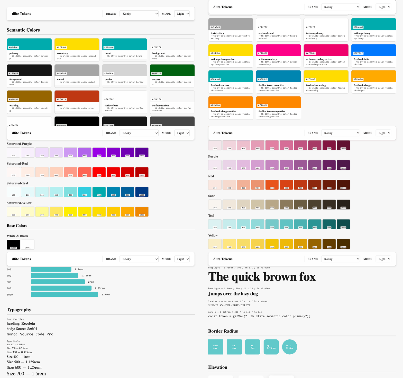
dLite Tokens is a multi-brand, multi-theme design token foundation built on Style Dictionary v5 and the W3C DTCG spec: the 2025.10 format module, including the sRGB color module. It's published to npm as style-dictionary-dlite-tokens and is the exact system re-skinning this site live: every color, radius, shadow, and motion value on this page is one of its tokens.
What started as a single-brand color palette is now four real brands, each with their own themes, running across two platforms (CSS custom properties for web, typed JavaScript objects for React Native) from one source of truth.
Three tiers, one inheritance chain
Tokens resolve through a strict hierarchy: primitives (context-free raw values like blue.500, spacing.400, radius.md) feed semantic tokens (purpose-driven decisions like color.primary or color.feedback-danger that reference primitives), which compose into a global tier via $extends. Every brand then $extends global and layers its own theme + mode overrides on top.
{
  "primary": {
    "$value": "{primitive.color.blue.500}",
    "$extensions": { "mode": { "dark": "{primitive.color.blue.400}" } }
  }
}
Dark-mode values live right next to their light counterpart via $extensions.mode, not in a parallel file, so a brand only has to declare the tokens it actually wants to override, and everything else falls through to global. At build time, build.ts loads every .tokens.json file, resolves chained $extends references (deep merge per DTCG §6.4), discovers every theme × mode combination per brand, and feeds the resolved set into Style Dictionary for platform output.
Four brands, one system
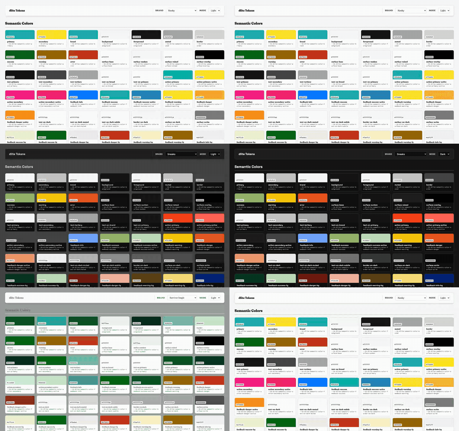
Puente is the real nonprofit I co-founded: blue and yellow, serious and utilitarian, because it's field software for community health workers. Survivor is this site's own default theme (its name, in fact) and ships three variants: default, a green Jungle theme, and a red-and-green Winter Holiday theme for the season. Kooky is deliberately loud, saturated teal and yellow, built to stress-test that the system doesn't secretly assume "serious SaaS blue" anywhere.
Sneaks is the newest brand and the first to break a pattern every other brand had followed by convention: everywhere else, color.primary, color.brand, and color.action-primary are the same hue. Sneaks splits them on purpose: a near-black/near-white "ink" for identity (chrome, splash screen) paired with a single vivid red reserved only for interactive elements. It's a real test of whether "brand color" and "interactive color" were actually two separate concerns the token schema could express, or just one I'd been conflating. (They were separate; the schema didn't need to change, only the discipline of not assuming primary === actionPrimary when consuming it.)
Fonts and motion are tokens too
Each brand also gets its own heading font as a design decision, not just colors: Kooky uses Recoleta for both heading and body, Survivor uses Fraunces, Puente uses Plus Jakarta Sans, all layered over shared global body (Source Serif 4) and mono (Source Code Pro) fonts. A snapshot test suite (brand-fonts.test.ts) asserts these brand → font contracts directly against the built dist/ output, so a font substitution regressing silently would fail CI, not get noticed three releases later.
Motion shipped as a breaking 0.3.0 change: durations, spring presets, easing curves, and scale/opacity values under semantic.motion.*, exposed as --tk-dlite-semantic-motion-* CSS custom properties on web and as typed constants on React Native for driving Reanimated. Two platform-specific usage docs ship in the repo so a consumer doesn't have to reverse-engineer the right way to wire a CSS transition versus a useAnimatedStyle hook from token names alone.
Infra that catches regressions before they publish
Every PR runs a GitHub Actions CI job that builds the tokens and runs the Vitest suite: snapshot tests against the actual dist/ output (dist-snapshots.test.ts) so a primitive change that silently reshuffles a brand's resolved CSS doesn't slip through unreviewed. main auto-deploys the live brand/mode preview to GitHub Pages, and releases publish through commit-and-tag-version off conventional commits (enforced by commitlint + husky), so the CHANGELOG is generated from commit messages, not written by hand after the fact. Publishing to npm went through its own hardening: it started on a long-lived NPM_TOKEN secret and was later switched to OIDC trusted publishing, removing a standing credential from the pipeline entirely.
That pipeline has already caught real regressions: a contrast fix landed on brand colors, then a second a11y contrast pass, then (most recently) a dark-mode audit on the Sneaks brand after its initial dark values shipped too pale to meet contrast targets. Each of those was a token-only fix, verified by the snapshot suite, published through the same pipeline, with zero code changes required in any of the four real consumers.
One token layer, several real apps
The same package versions across every consumer that uses it: this portfolio (CSS custom properties, live brand switching in the footer above), Puente Collect (React Native, Parse-backed field data collection), the Sneaks monorepo (React Native + Next.js, sharing one Supabase backend), and HablaLora (React Native, Expo). A token or brand change in this repo, published once, propagates to a CSS site and two mobile apps on their next npm install: one design decision, four surfaces.
Stack
Style Dictionary v5, TypeScript for the custom build pipeline ($extends resolution, mode merging, multi-brand/theme/mode discovery), Vitest for snapshot + font-contract tests, Vite for the live brand/mode preview app, GitHub Actions for CI/CD, and commit-and-tag-version + conventional commits for changelog-driven releases.