How many versions of a mobile data collection application can we create?
Outcome (Version 4)
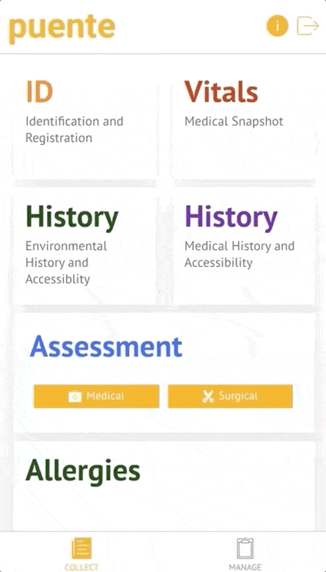
Key win was nailing member record navigation
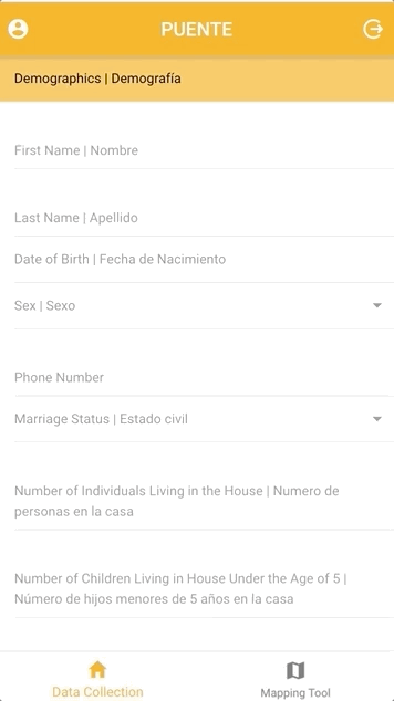
Through multiple iterations of building the mobile application, we learned that the form itself is the root element that governs how the user collects data. We realized we needed to orient our navigation structure to match the mental model of our users, who collect multiple forms sequentially for a community member in the same setting. Our old experience required users to jump between navigational levels multiple times to collect forms, severely slowing them down. We prioritized accessibility to frequently used forms and implemented a simple, intuitive interface to help users quickly access the information they need.
Turning a technical constraint into a UX win
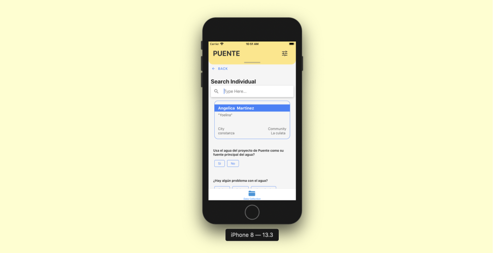
This was one of the most challenging and rewarding aspects of building this mobile application. Incorporating advanced data collection features such as record linking and geotagging required us to think creatively about integrating complex features into a streamlined app. Previously, users had to link records manually, which was time-consuming and error-prone. We soon learned that if users were usually going to complete multiple forms for one user, we could save the record ID of the surveyee that the data collector just collected data from. We provided a visual indicator (name of surveyee) to show that the record had been saved and is available for more forms to be collected. This was a smashing success. Users felt they could collect twice as many surveyees in the same time due to not having to search for the original record ID. It was fun to creatively tackle complex data constraints and simplify the experience for the user.
Approach
So...many...versions
Version 1 of the application was very straightforward and was early in my frontend/mobile application career. The design choices we had to make were limited to development skills. What we learned from our research was that, at a minimum, we need A) the app to be bilingual and B) we need a comprehensive list of questions.
Version 2 solved one of our problems. The underlying database that was being created for the information that was collected was precisely what we wanted. However, the user experience was abysmal. Version 3 came with the explicit goal of addressing the user's pain points concerning the speed of data collection and the enjoyability of the experience.
Version 3