Puente Collect
Puente Collect is the field data-collection app for Puente Desarrollo Internacional, a small nonprofit doing community health and development work in the Dominican Republic. Community health workers go door to door (often somewhere cell signal is a rumor, not a guarantee), logging resident IDs, environmental health surveys, and medical intake forms that used to live on paper, in a filing cabinet, in whatever handwriting survived the humidity.
The job the app has to do is boring on purpose: get a form filled out fast, in the field, whether or not the phone has signal, and get it into the org's system without the worker ever having to think about connectivity.
Onboarding that actually explains the app
First run walks through what the app is for before it asks for anything: a short carousel covering the four kinds of evidence it captures (stories, metrics, location, photos), why it needs camera and location access, and how offline sync keeps a field team productive without signal.
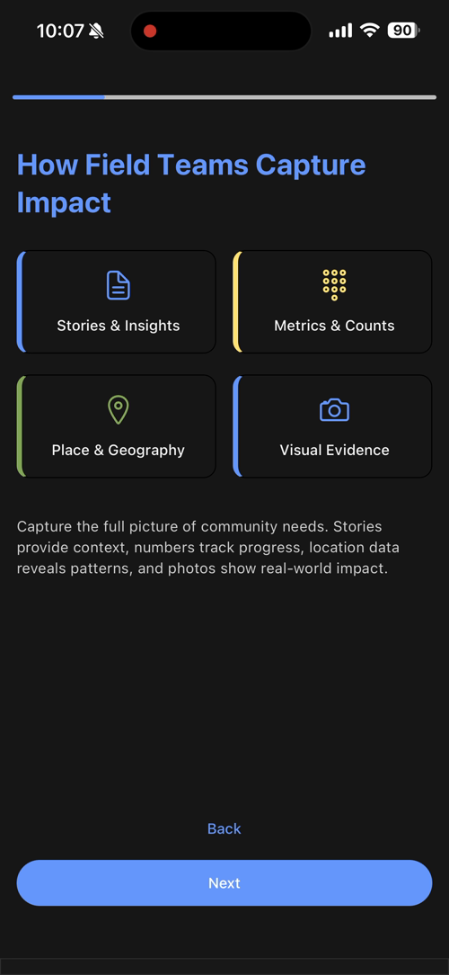
Then it asks the worker to set up their own experience (language and theme) and applies each choice to the onboarding screens themselves, live, so the choice is legible immediately instead of a setting you configure blind and hope looks right later.
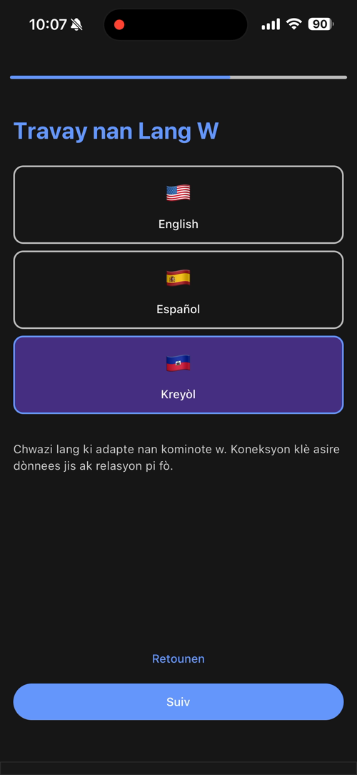
Kreyòl sits next to English and Español, not as an afterthought: Haiti borders the Dominican Republic, and a health worker's community isn't guaranteed to share the org's default language.
What a health worker actually sees
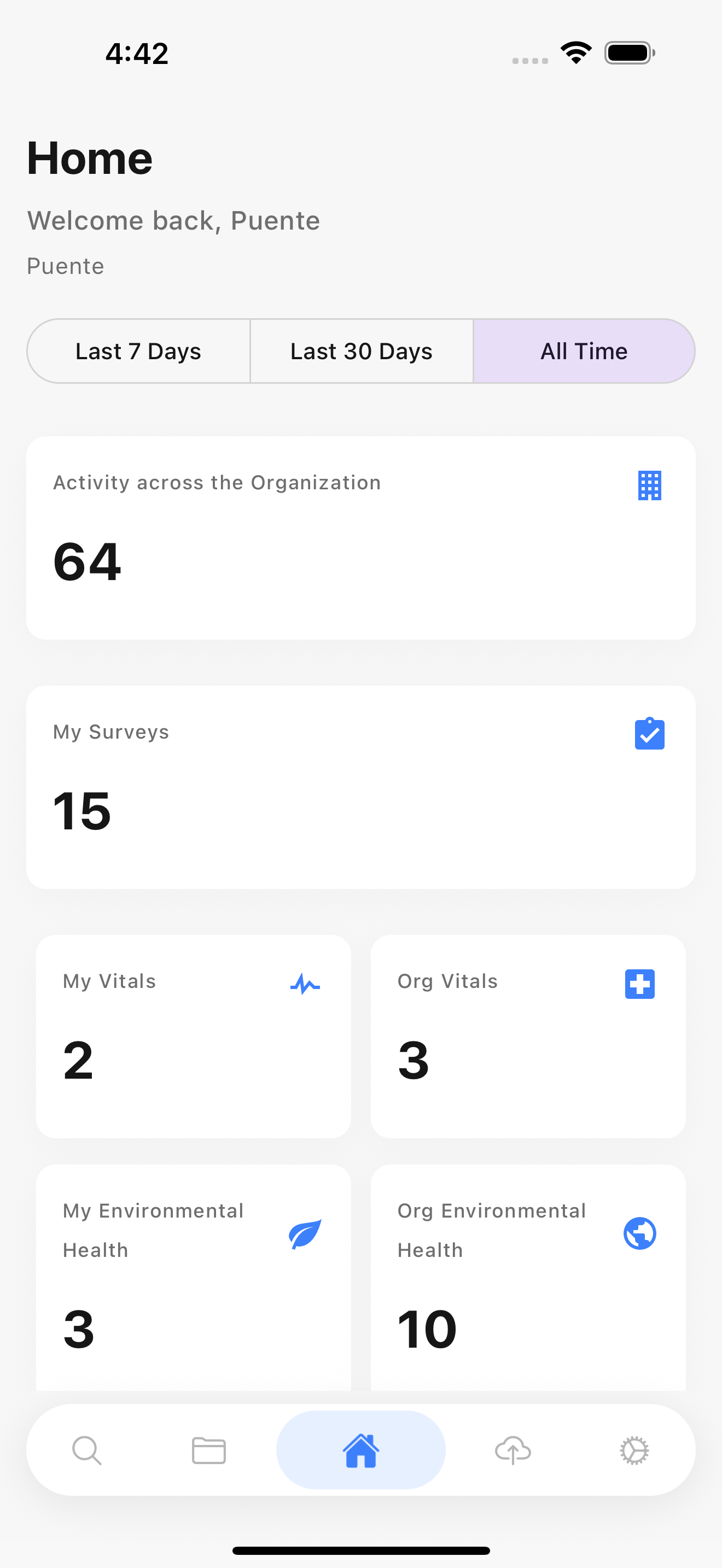
Home is a stats dashboard, not a marketing wall: activity across the whole organization, the worker's own survey count, vitals, and environmental health tallies, filterable by last 7 days / 30 days / all time. It's the screen someone checks on a Friday to feel like a week of door-knocking added up to something.
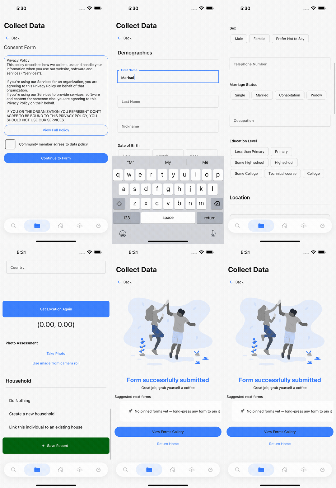
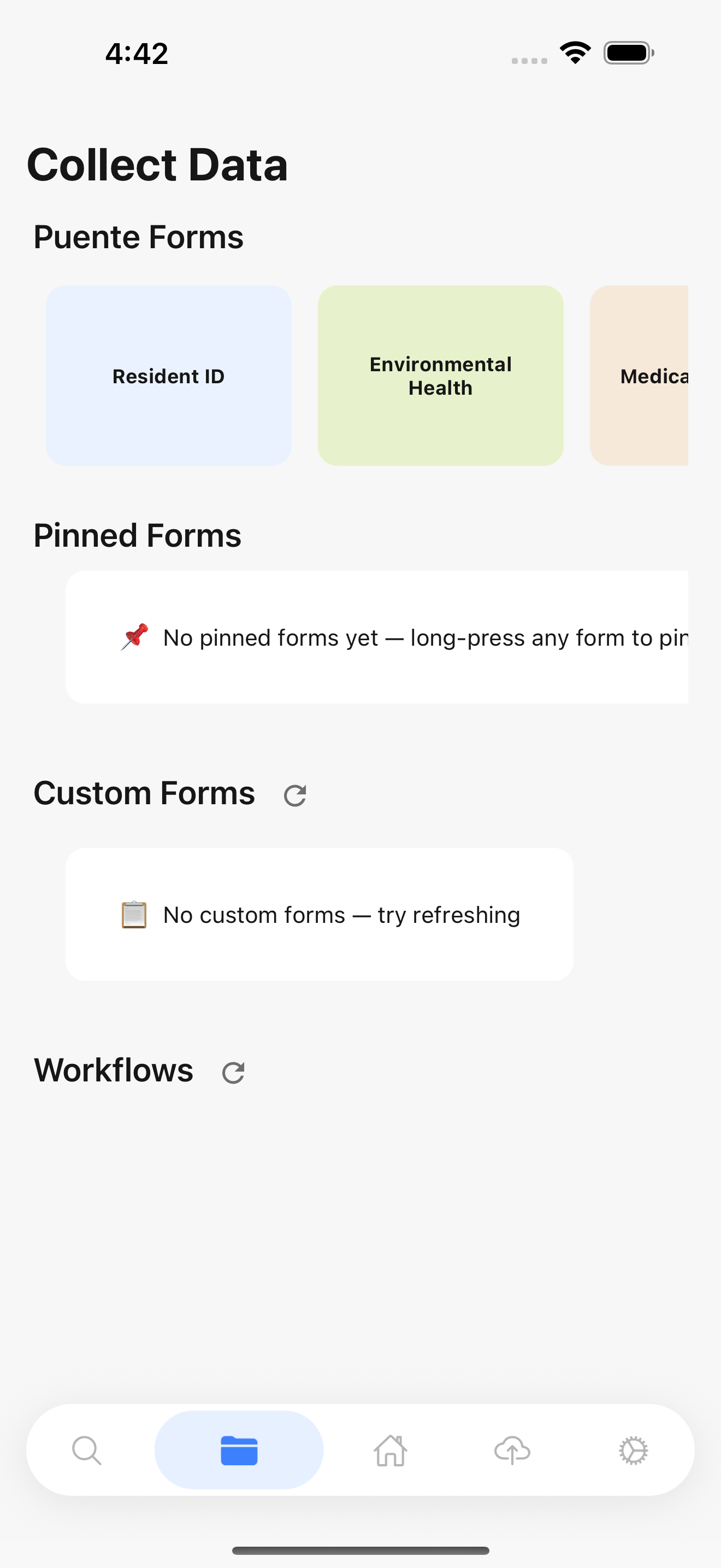
Collect Data is where the actual field work happens: a horizontally scrolling row of form types (Resident ID, Environmental Health, Medical intake, and more as the org adds them), a pinned-forms shortcut for whatever a given worker fills out constantly, and a Custom Forms / Workflows section for org-specific surveys that show up without an app update.
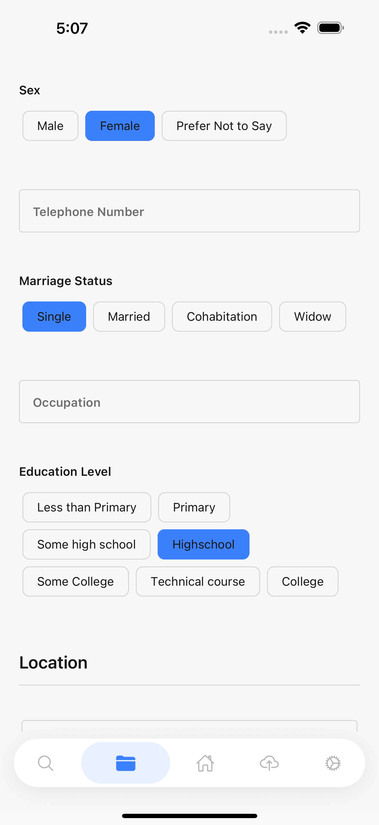
A Resident ID submission starts with a consent screen (a community member has to actively agree before anything about them gets typed in), then a Demographics form: name, date of birth, sex, marriage status, education level, occupation, photo, and an optional link to an existing household record so a family isn't re-entered from scratch every visit.
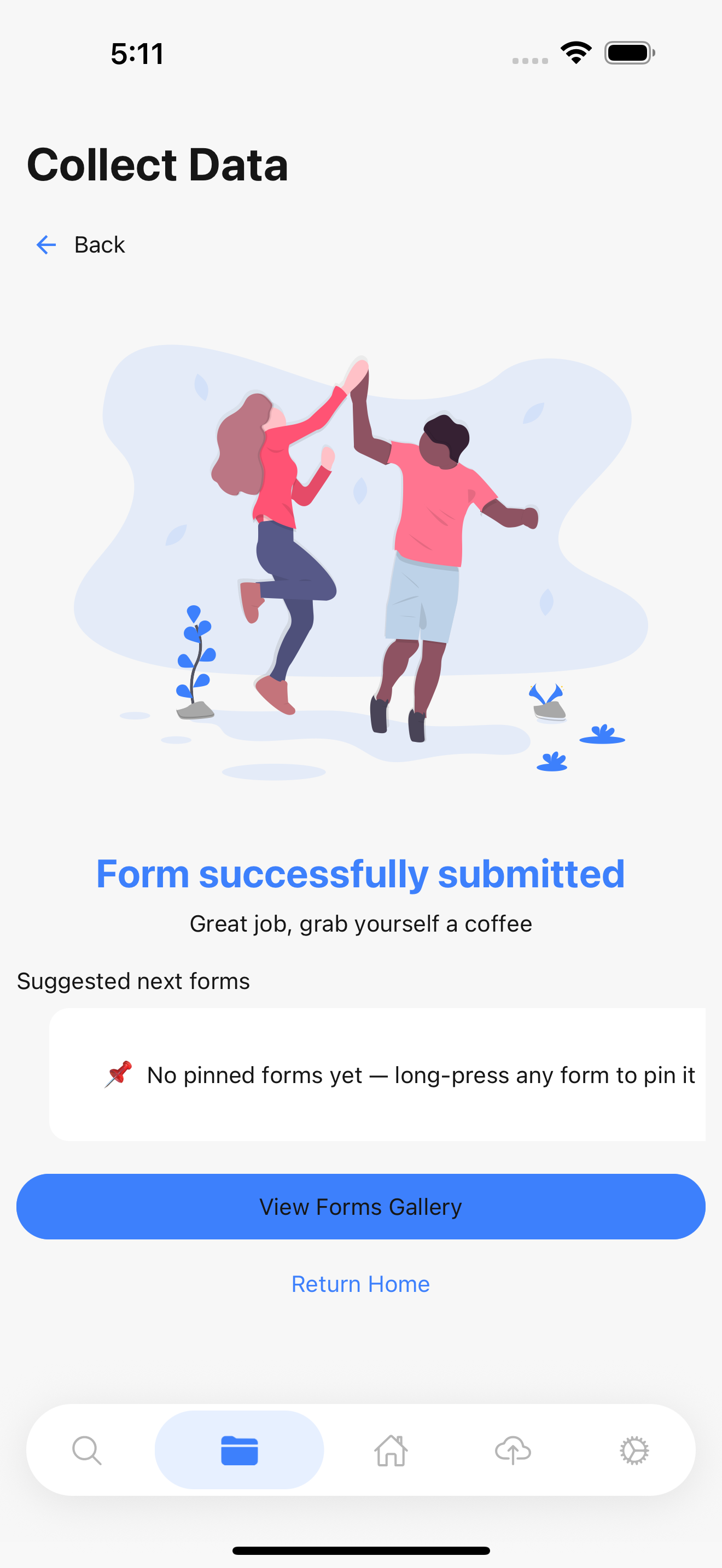
Saving it doesn't just show a checkmark. It's a full-screen illustration and "great job, grab yourself a coffee," a small thing, but a deliberate one. Nobody in the field gets a manager standing over their shoulder saying good work; the app is what tells them the data landed.
Find Records is full-text search across every resident and asset the org has ever collected. Tap a result and you can edit a previously submitted form instead of the old create-only workflow, with a "View Record History" button behind every record so a correction never silently overwrites what was there before. This was the single most technically substantial feature I shipped on the app, and it's the difference between "fix a typo" meaning a phone call to me and meaning a two-minute in-app edit.
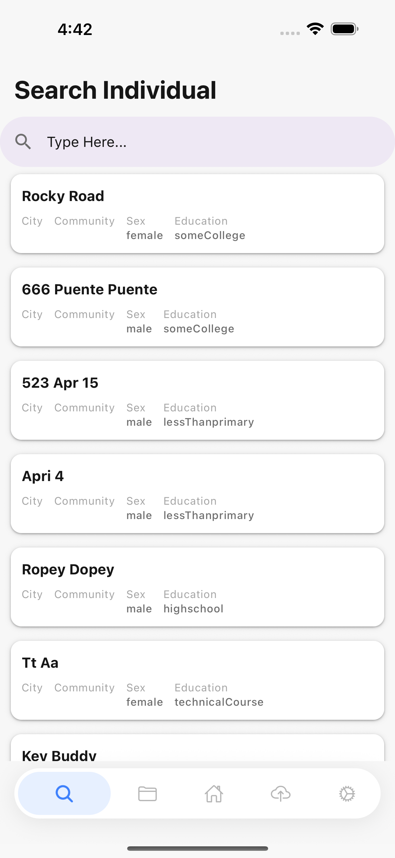
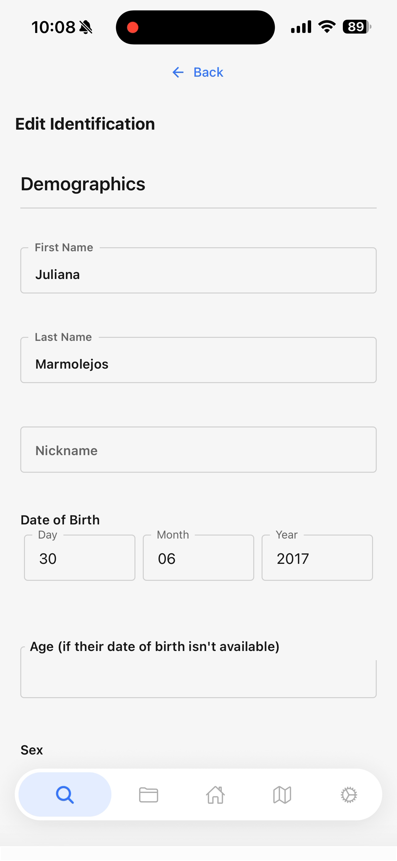
Offline Sync is the tab that matters most and gets looked at least: submit a form with no signal and it queues locally, syncing the moment the phone finds a connection: no re-entry, no lost work, no "did that actually save?" moment while standing in someone's living room.
Making all of that not embarrassing
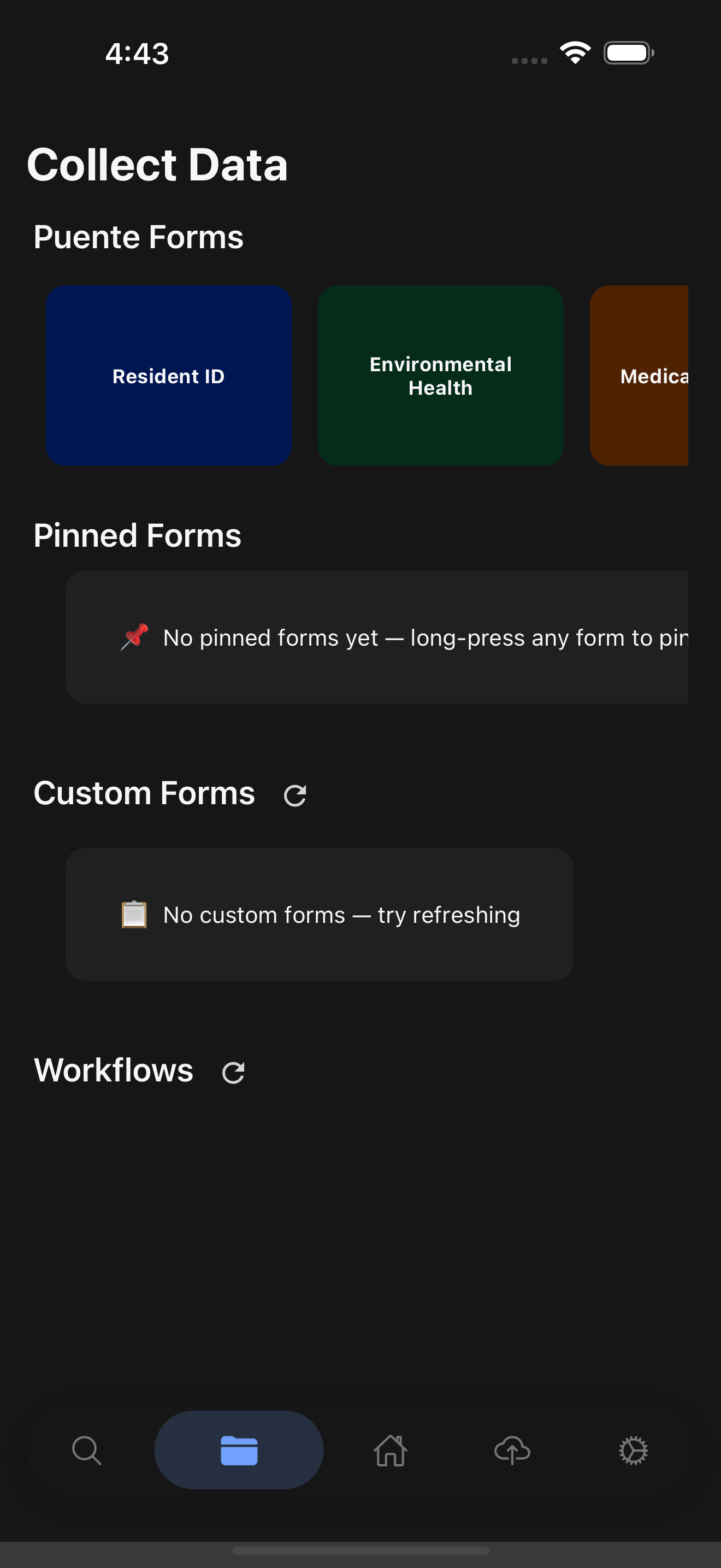
None of that is interesting if the app looks and feels like an afterthought, so it went through a real modernization arc alongside the feature work. The UI used to be hundreds of raw hex values sprinkled across StyleSheets, which meant dark mode was cosmetic: most components just ignored the active theme. I adopted style-dictionary-dlite-tokens (the same package that themes this site) as the single source of truth: primitive colors, spacing, radii, and semantic tokens that swap automatically between light and dark. A strict surface hierarchy (background → surface → raised → sunken → overlay) replaced what had been inconsistent, ad-hoc layering (auth screens, for instance, had been rendering the brand color as a full-screen background in dark mode). Same screens above, same components, no per-brand or per-mode special-casing anywhere in the app code, just tokens resolving differently.
Animation code was split across the old RN Animated API and Reanimated, with spring configs hardcoded wherever someone needed one. I rebuilt it Reanimated-only, around three named aggression levels (playful/mega for celebrations and empty states, snappy/standard for buttons and cards, tight/quick for icons and micro-feedback) so every animation in the app draws from the same vocabulary instead of an inline guess.

Calm Mode (visible above) is a good example of why that vocabulary matters: it's a separate flag from the OS-level "reduce motion" setting, so a field worker can dial animation down for a clinical, focused feel without touching their phone's accessibility settings.
Guardrails that actually block merges
Nine CI checks now gate every PR: token-import linting, animation-rule linting, i18n completeness, locale sync, unit/integration/snapshot tests, and a secret scanner. On top of that I built narrow-purpose Claude Code agents: one audits token compliance, one audits motion-rule compliance, one audits UX delight specifically for field conditions (does an offline save say "saved offline," does a sync error give the user a way to recover, is form data ever silently cleared on failure). For an app health workers trust with a household's data outdoors and offline, those aren't cosmetic checks.
Stack
React Native, Expo 55, Reanimated, Parse, style-dictionary-dlite-tokens, EAS Build/Update, Maestro for visual QA, and a set of Claude Code skills/agents enforcing the design system and TDD workflow on every change.